
When an introduction matters
Full lockup: wordmark and descriptor. For introductions, documents and larger applications.
Our visual language, from a mark on screen to the texture of an object worth keeping.
Explore the identity ↓The wordmark, the full descriptor lockup and the compact symbol. Choose for the context; never reshape the identity to fit.
Primary wordmark · cyan.
SVG ↓Full lockup: wordmark and descriptor. For introductions, documents and larger applications.

Use the supplied symbol for small applications. Never create it by cropping the wordmark.
The decorative version has no cut-out divisions. Use it large on an even background, as specified in the original guide.
Clear space follows the module of the original mark. Keep text, layout edges and graphics outside it. The original diagram is preserved in the new brand book appendix.
View the PDF diagram ↗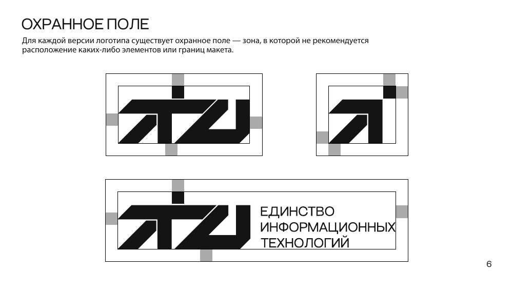
Minimum print widths from the original guide. Debossing and embroidery sizes require a material sample.
Three core colours from the brand guide. White is the neutral option for contrasting applications.
RGB 99 / 246 / 248
CMYK 53 / 0 / 14 / 0
RGB 95 / 188 / 238
CMYK 60 / 0 / 0 / 0
RGB 20 / 20 / 20
CMYK 73 / 67 / 65 / 81
Values follow the PDF. Digital cyan is normalised to #63F6F8; some original SVGs specify #00FBF9. Agree on the print profile, material and proof before production; RGB is not a print specification.
Gothic 60 is the guide’s signature typeface: identity, expressive headings and short statements.
Onest complements the current website for body copy, interface text and captions. It extends the digital system without replacing the signature typeface.
Onest / Аа Бб 0123456789Leather, cotton, metal and paper. One language with different textures. Application concepts help choose a production direction.
A small mark in the lower corner. Texture and precision matter more than the size of the logo.
A compact chest logo. Before embroidery, check that fine gaps and the detached square remain distinct.
White artwork on dark, black artwork on light. The logo sits in the upper area; the website address completes the layout.
A presentation box, metal pen and substantial card. Restrained finishing, one accent and no unnecessary ornament.
Mockups visualise concepts, not manufactured products or print-ready artwork. Use SVG masters for production geometry and verify finish, size and legibility on a sample. Debossing and foil are new material recommendations, not screen effects for the logo.
These web recommendations extend the original guide: the mark stays crisp while motion belongs to the space around it.
Disciplines / About↗The mark anchors the composition.
The ribbon carries the story.
Place the wordmark on the left and link it to home. Keep its proportions. On small screens, omit the descriptor rather than compressing the mark.
Use cyan or white on dark, black on light. Keep ribbons, photography and text outside the clear space.
Never stretch, dismantle or rotate letters independently. Preserve legibility and respect reduced-motion preferences.
21 pages · logos, digital and applications · Russian
↓SVG / ZIPDigital logo kitWordmark, descriptor, symbol and ALT
↓This page is based on ITU_guide.pdf (2025). Digital recommendations and application concepts were added in 2026. Font files and print AI masters are not included in the digital kit.
Let’s choose the right mark, material and production method.
general@itunity.dev ↗Telegram ↗